I never really read Bloomberg. I watched a video now and then, but always went straight to the technology video page. Now, I do read articles occasionally and even visit the homepage. And that’s probably what’s wrong with Bloomberg’s new bold design.
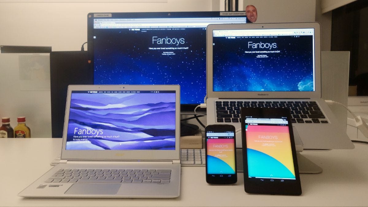
Joshua Topolsky, his team at Bloomberg and Code and Theory already teased the massive design overhaul with the introduction of Bloomberg Politics. Topolsky wanted to bring the best from print design (especially Businessweek) to the web. But the web isn’t static and I love it when (news)sites use unique designs to tell their story. One of my favorites is a story about fanboys from The Verge, the site Topolsky founded.

As you can see, the site adapts to the platform you are using. This is something you will never be able to do in print design. The most beautifully designed reviews are the PS4 and Xbox One reviews from Polygon. But these are examples of individual stories. The influence of print design can be found everywhere on the new Bloomberg.

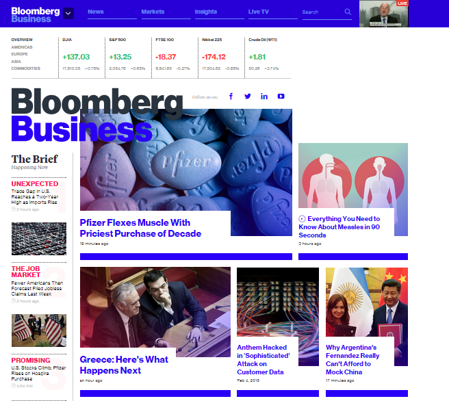
The logo that sits half on top of the image is no CSS bug. Neither are the pink/purple filters on top of the images. But the screencap above is not how the site will look every time you visit: “Editors can very quickly reshuffle what we’re doing on the page, because every module is movable.” Topolsky also says the team is experimenting with finding the right balance between images and text on mobile.
Like I said a few weeks ago, I love a simple overview of the latest news, just a bunch of headlines is enough for me. That’s something I’m missing on Bloomberg, but yeah, that’s just my personal preference. What’s interesting however is customization. What if I was able to pick my own colors? Or maybe even modify the structure of the site a little bit? I understand this is dangerous, but I also think it’s something we will be able to do to some extent in the future.
I never read Bloomberg and now I do, because the site is visually appealing in my opinion. I actually love it. But I don’t think Bloomberg wanted to expand to a broader audience. The people who read Bloomberg are industry people, business people. Look at the comments underneath the Wired article about the redesign. Isn’t a new design a failure if the core audience walks away?
P.S. I love the 404 and 500 error pages.
What I don’t understand is that if the URL to a feature is something like http://www.bloomberg.com/news/features/2015-02-02/inside-radioshack-s-slow-motion-collapse they don’t have a bloomberg.com/news/features page where I can see all of their features. But this is not only the case on Bloomberg.
You can read more about the Bloomberg redesign on VentureBeat, Wired and NiemanLab.
