
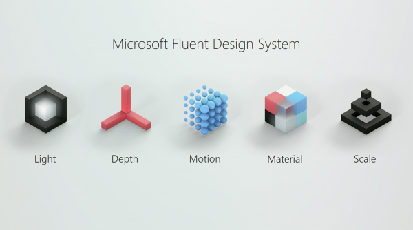
But things might also look a bit different thanks to the Fluent Design system Microsoft announced last year. It’s a way to give more meaning and structure to how Windows 10 apps and the OS itself should look. It’s based around these five principles:
A lot of these principles are also found in other design systems, such as Google’s Material Design and it’s safe to say that flat design is over.
Acrylic
Acrylic probably is the most noticeable element: a window shows what’s behind it in a blurry way.

Reveal
Reveal is another element that makes use of light, as you can see in these images from Windows Central:Depth
Depth adds a bit more hierarchy to the on-screen elements and can be found in the parallax scrolling effects in the Windows Store.Overall, these changes seem relatively minor and I think they are. Windows 10 still looks like Windows 10, although it’s more refined and complete now. Most apps you use such as Chrome and even Microsoft’s own Office don’t show the changes. But once you have installed the Spring Creators Update you will be greeted by a fresh lick of paint.